AI insights
-
What is the main takeaway from this article?
A 7-part audit for designers who want their portfolio to prove value, reduce risk, and earn trust fast After more than 350 mentoring sessions on ADPList, I keep seeing the same pattern: talented designers lose momentum because their portfolios explain the work without proving its
Topic focus: Core Claim -
Which core concept does the article explain?
That is the gap this framework is built to close.
-
What practical action does the article suggest?
A portfolio is not a gallery, a school archive, or a dumping ground for every artifact you made.
-
What supporting detail or evidence is highlighted?
And like any good product, it needs clear users operating under strict constraints.
-
What common mistake or risk should readers avoid?
Recruiters are known to make an initial resume judgment in seconds.
Topic focus: Pitfall -
What example from the article makes the idea clearer?
For portfolios, I tell designers to treat the first case-study review as if they have about 29 seconds to make the value legible: your work is judged quickly, and your portfolio has to perform under that condition.
Topic focus: Data Point -
What is a good next step after reading this article?
This rubric is built around 7 audit areas, 2 core audiences, and a handful of numbers that matter more than most designers think.
Topic focus: Definition
- Treat your portfolio as the most important UX product, build recruiter and hiring manager personas, and show how you solve problems and boost team success.
- Make accessibility and compliance non-negotiable by meeting contrast, text size, zoom resilience, and touch targets, with explicit reasons why.
- With 60-70% mobile traffic, ensure a readable homepage, avoid desktop-first layouts, and prevent dense, long-scrolling journeys on phones.
- Use STAR to structure case studies, separate qualitative and quantitative insights, and clearly show what changed for users and teams.
- Highlight business rationale and DesignOps, demonstrating cross-functional collaboration and how the work improves speed, cost, and reliability at scale.
A 7-part audit for designers who want their portfolio to prove value, reduce risk, and earn trust fast
After more than 350 mentoring sessions on ADPList, I keep seeing the same pattern: talented designers lose momentum because their portfolios explain the work without proving its value.
That is the gap this framework is built to close.
A portfolio is not a gallery, a school archive, or a dumping ground for every artifact you made. A portfolio is a product.
And like any good product, it needs clear users operating under strict constraints. The main constraint is time.
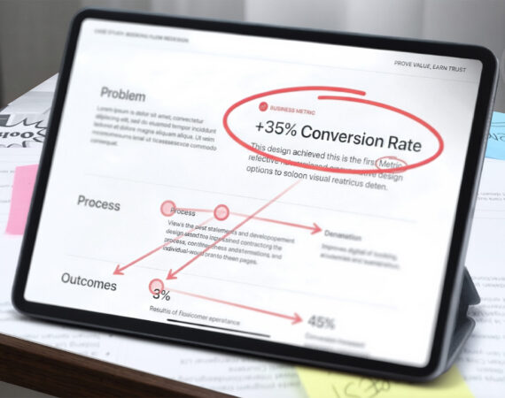
The urgency is real. Recruiters are known to make an initial resume judgment in seconds. For portfolios, I tell designers to treat the first case-study review as if they have about 29 seconds to make the value legible: your work is judged quickly, and your portfolio has to perform under that condition.
This rubric is built around 7 audit areas, 2 core audiences, and a handful of numbers that matter more than most designers think. If your portfolio fails either audience, the rest of your story does not get read.
1. The Portfolio as a Product: Strategic Alignment
Treat your portfolio like the most important UX product of your career.
The first thing I would tell any designer is simple: build personas for your portfolio.
Your recruiter persona is trying to validate fit quickly. Your hiring manager persona is asking a different question: Can this designer solve problems, work well with the team, reduce delivery risk, and make this organization more successful?
That is the strategic shift many portfolios never make. They are built from the mindset of
“I am a designer looking for a job”, instead of “I am a designer who can help you solve problems that matter”.
That difference changes the whole product strategy.
Your homepage, project cards, and case study structure should not just say what you made. They should help each audience answer what they need to know.
For the recruiter, surface:
- role and level
- domain or product space
- tools and functional strengths
- visible outcomes or business signals
For the hiring manager, surface:
- judgment and decision quality
- problem-solving under constraints
- collaboration across functions
- evidence that the work changed something important
- signs that you elevate team capability, not just your own output
That last point matters at the senior level. Strong portfolios show that the designer not only solves a problem personally, but they improved how the team works through clearer workflows, reusable systems, better documentation, stronger alignment, or mentoring that made delivery more reliable.
A case study should not read like: “Here is what I did.” It should read like: “Here is the problem I helped solve, how I approached it, who I worked with, how I strengthened the team, and what changed because of it.”
The test is simple: does your portfolio position you as a job seeker, or as a problem solver, a team can trust? If it is doing the first and not the second, the product strategy is off.
2. Technical Accessibility and Compliance
Accessibility is not a bonus layer. It is one of the fastest ways a hiring team decides whether your work feels safe to trust.
A portfolio with weak contrast, tiny body copy, broken keyboard access, or layouts that fail under zoom does not just look unfinished. It raises a deeper concern: can this designer be trusted with production-facing work where quality, compliance, and usability matter?
There are four numbers I would check first:
- 4.5:1 minimum contrast ratio for normal text
- 3:1 minimum contrast ratio for large text and key non-text UI elements
- 200% text resize without breaking content or functionality
- 24×24 CSS pixels minimum touch target size for pointer inputs under WCAG 2.2, unless an exception applies
As a practical baseline, body text should usually start around 16px or larger. Smaller text is not automatically wrong, but it puts pressure on contrast, spacing, and legibility very quickly.
This is the compliance side of the audit. If you miss these basics in your own portfolio, a hiring manager may reasonably question whether you understand delivery quality, governance, and accessibility obligations in real products. It also reinforces why accessibility and mobile usability are connected: undersized targets are not only a compliance issue, they are a comprehension and interaction problem on phones.
Red flag: 3.5:1 contrast on paragraph text
Why it hurts: It signals a weak accessibility judgment on the most basic reading layer.
Red flag: Content that breaks or overlaps at 200% zoom
Why it hurts: It suggests poor resilience under common accessibility requirements.
Red flag: Keyboard traps or inaccessible embedded content.
Why it hurts: It signals technical carelessness in a public-facing artifact.
Accessibility is not only about ethics. It is also about professional credibility.
3. Mobile Consumption and Comprehension Reality
Mobile optimization is a different problem from compliance, and it deserves its own audit.
In mentoring sessions, I increasingly hear from designers who have analytics on their portfolios that roughly 60–70% of visits come from mobile. That tracks with reality. Recruiters and hiring managers are busy. They may open your portfolio between meetings, in transit, or while triaging candidates on the phone.
That means responsiveness is not a nice-to-have. It is part of comprehension.
If your homepage looks elegant on desktop but becomes dense, hard to scan, or visually fragile on mobile, you are creating friction at the exact moment you need clarity. The issue is not only responsive layout. It is whether someone can understand your role, project scope, and business outcome without pinching, zooming, or decoding the page.
Red flag: Desktop-first layouts that collapse into long, exhausting scrolls.
Why it hurts: The reader loses narrative structure, and key information gets buried.
Red flag: Tiny screenshots with unreadable captions.
Why it hurts: Your evidence becomes decorative instead of useful.
Red flag: Hero sections that consume the whole phone screen before any signal appears.
Why it hurts: You waste the most valuable attention window on decorative hero graphics or abstract visual styling instead of fit or value.
Accessibility supports comprehension here, too, but the lens is different. Section 2 is about technical trust and compliance. This section is about the consumption reality.
4. Research Methodology and Narrative Discipline
A surprising number of portfolios still confuse research activity with research rigor.
In mentoring reviews, I often see the same pattern: a designer shows the survey, sticky notes, affinity map, journey map, wireframes, and final UI, but never explains what changed because of the research. The reader sees volume, not judgment.
That is why I push this rule hard: artifacts are not evidence unless they produce insight.
One useful structure here is STAR: Situation, Task, Action, Result. Most designers know it as an interview framework, but it works just as well for portfolios. It can shape the entire portfolio and the sections inside each case study.
Use it to keep the story focused:
- Situation: What was broken, unclear, risky, or underperforming?
- Task: What were you responsible for solving?
- Action: What research, collaboration, and design decisions did you drive?
- Result: What changed for the user, team, or business?
This is where research earns its place. The point is not to prove that you used methods. The point is to show why the research was necessary and what it unlocked.
Qualitative and quantitative methods should also stay distinct in your storytelling. They answer different questions.
- Quantitative work helps show breadth, scale, frequency, or directional confidence.
- Qualitative work helps explain the why, the tension, and the behavior behind the pattern.
You do not need to pretend every project has perfect statistical certainty. You do need to show methodological honesty. If you ran a survey, explain what it was good for. If you ran interviews, show the recurring themes and the decision those insights shaped.
When a standard artifact is not enough, use a more systemic one and explain why. For example, a service blueprint should not appear as a prettier journey map. It should capture front-stage user actions, back-stage processes, handoffs between teams, dependencies, failure points, and the operational friction behind the experience.
Use contrast in how you present research.
Noise: A full-screen image of 500 sticky notes.
Signal: The 3 recurring user tensions that led to a change in task flow.
Noise: Listing methods with no rationale.
Signal: Explaining why interviews were the right tool for a trust problem and why a survey would have been too shallow.
Noise: A journey map because “that is part of UX”.
Signal: A service blueprint that reveals where the front-stage experience fails because back-stage operations are misaligned.
That last example matters. More mature portfolios show that the designer knew when a standard artifact was not enough.
5. Business Rationale, DesignOps, and Systems Thinking
This is where a portfolio starts to feel senior.
A lot of case studies still stop at interface improvement. They show the screen that changed, but not the system that moved because of it. That makes the work look smaller than it was.
Strong portfolios explain the business rationale behind the design. They show how the work affected speed, trust, conversion, support load, time on task, team coordination, or operational cost. They also show whether the designer understood the delivery environment: governance, constraints, design systems, compliance requirements, handoff quality, and cross-functional alignment.
That is the DesignOps edge many portfolios miss.
A strong case study does not only say, “Here is the UI I designed.” It says, “Here is how I worked inside a scalable system to increase delivery quality, collaborate across functions, and reduce downstream friction.”
Effective cross-functional collaboration is the proof point here, because no real product problem gets solved in a bubble. Show how you worked with engineering, product, marketing, customer support, business leaders, or operations to get to a viable solution. That tells a hiring manager you understand design as part of an organization, not as a solo performance.
If you are designing a pharmacy kiosk, the ROI is not the interface. The ROI is shifting low-value administrative work away from the pharmacist, freeing expensive human labor for higher-value tasks. The design improves the user experience, but it also changes how labor, time, and attention are allocated inside the business.
That is what many hiring managers want to see from more senior designers: not just that you can improve a flow, but that you can understand the ecosystem around the flow and work with the people responsible for it.
Use this contrast in your case studies.
Weak: I redesigned the booking experience.
Stronger: I worked with product, engineering, and support to reduce repeated support requests, improve booking clarity, and move the new flow into a governed component library that reduced downstream developer rework and sped up release readiness.
Weak: I created a new dashboard.
Stronger: I partnered with stakeholders across teams to standardize data patterns, reduce design debt, improve compliance consistency, and create reusable foundations that made future dashboard work faster across the product portfolio.
Weak: I improved the workflow.
Stronger: I introduced a clearer delivery workflow, reusable documentation, and review checkpoints that improved team capability, reduced avoidable iteration, and made cross-functional handoff more reliable.
If your project involved governance, accessibility constraints, documentation, stakeholder workshops, component reuse, or cross-functional negotiation, that belongs in the story. Those details show that you can ship inside reality.
6. AI Fluency and Modern Workflow
A modern portfolio should show how you operate in the current product landscape.
That does not mean sprinkling the letters AI into a case study to sound current. It means showing judgment.
There are two ways AI belongs in a portfolio.
The first is workflow acceleration. If you use AI to speed up synthesis, content structuring, early ideation, design system documentation, prototype scaffolding, or research preparation, explain where it helped and where your own judgment overruled it. A strong portfolio does not present AI output as design thinking. It shows that you know how to use acceleration without outsourcing responsibility.
The second is product design competence. If you worked on AI-driven features, your case study should show more than the interface. It should show how you thought about model uncertainty, failure states, user trust, explainability, fallback paths, prompt or context design, and the boundaries of automation.
The question a hiring manager is asking is not “Did this designer use AI?” The question is “Does this designer understand how to use new tools responsibly and design for systems that are less predictable than traditional software?”
If your portfolio ignores that context completely, it risks feeling behind the market.
Use contrast here, too.
Weak: A screenshot of a prompt used to generate personas or ideas.
Stronger: A clear breakdown of where AI accelerated synthesis, where human judgment overruled weak output, and what decision changed because of that review.
Weak: Saying “I used AI in my process”.
Stronger: Explaining that AI helped cluster early themes from research notes, but final problem framing, prioritization, and design decisions were validated by human review and stakeholder input.
Weak: Showing only the interface of an AI feature.
Stronger: Showing how you designed for uncertainty, fallback behavior, trust, and recovery when the system is wrong.
7. Visual Communication and Artifact Evaluation
Visual clarity is not decoration in a portfolio. It is the layer that determines whether a busy reader understands your work correctly or misreads it in seconds.
One of the easiest ways to lose trust is to show before-and-after work without labeling it clearly.
Red flag: Old screen shown with no context.
Risk: The recruiter assumes the weak design is your current work.
Better: Label the old design clearly, annotate the friction, and make the delta easy to see.
Wireframes should also earn their place. If they are there because a case study feels incomplete without them, cut them. If they helped align stakeholders, test structure early, or simplify a complex idea before visual polish, keep them and explain that role.
The same standard applies to prototypes. If you embed one, it has to work.
A usable prototype has at least three basics:
- a clear starting point;
- a clear exit or reset path;
- no broken loops on the main happy path.
This sounds obvious, but it matters. When a prototype breaks, trust drops immediately. The issue is not only technical. It makes the rest of your case study feel less reliable.
Use visuals to reduce cognitive load, not increase it.
Final Audit: Replace Opinion With Tests
This framework turns a portfolio from a passive archive into an active proof-of-value document.
Do not end with a vague self-score. Pressure-test the portfolio with tasks someone else can verify.
- Hand your homepage to a peer for 10 seconds. Can they read back your role and one specific business metric or operational outcome from your primary case study?
- Open the portfolio on a phone. Can someone reach the first case study and understand the business outcome without pinching or zooming?
- Increase text size or browser zoom to 200%. Does the layout still work without overlap, truncation, or hidden content?
- Pick one project. Can a reviewer identify the Situation, Task, Action, and Result without you explaining it out loud?
- In that same project, can they distinguish user evidence from business impact?
- Can they point to where you collaborated with engineering, product, marketing, support, or leadership?
- If AI appears in the story, can they tell what the tool did, what you decided, and how risk or failure states were mitigated for the user?
- Are all before-and-after states labeled clearly, and does every embedded prototype have a clear start and exit path?
A portfolio does not need more pages. It needs stronger proof.
“You can show every step and still fail the review. What earns trust is not the volume of work. It is the clarity of judgment, the quality of execution, and the evidence that something important changed.”