AI insights
-
What is the main takeaway from the article 'Red Means Danger, Unless You Can’t See It'?
The main takeaway is that relying solely on color in design is a significant flaw that can lead to accessibility issues, affecting around 300 million people. The article emphasizes the need for practical design fixes that enhance accessibility for everyone.
Topic focus: Core Claim -
What does the article suggest about the use of color in design?
The article suggests that using color alone as a design element is a flaw rather than a stylistic choice. This reliance can create barriers for individuals who cannot perceive certain colors, highlighting the importance of inclusive design practices.
-
What practical design fixes does the article propose for improving accessibility?
The article proposes that interfaces should not rely solely on color to convey information, suggesting alternative methods such as text labels or patterns to ensure clarity for all users. This approach aims to create smarter interfaces that are accessible to everyone.
-
How does the article relate sci-fi interfaces to real-world design flaws?
The article uses examples from sci-fi, like glowing panels in Stargate SG-1, to illustrate how these fictional interfaces can reveal real-world accessibility failures. It shows that while sci-fi often highlights our ideals, it also mirrors our blind spots in design.
Topic focus: How To -
What is a key definition of accessibility as mentioned in the article?
Accessibility is defined in the article as a core value in design that reflects a commitment to inclusivity and empathy, ensuring that digital experiences are usable by everyone, regardless of their abilities.
Topic focus: Definition -
What important data point does the article mention regarding the impact of design flaws?
The article mentions that around 300 million people are affected by design flaws that rely solely on color, underscoring the critical need for more inclusive design practices to accommodate diverse users.
Topic focus: Data Point -
What is a common misconception about accessibility in design?
A common misconception is that accessibility is merely a checklist item rather than a fundamental aspect of design. The article stresses that true accessibility reflects a commitment to inclusivity and enhances user satisfaction.
Topic focus: Definition
- Ever wondered what a glowing crystal interface from Stargate SG-1 reveals about real-world accessibility?
- It turns out, a lot.
- In a gripping scene, a red light signals danger, but what if you can’t see that color?
- This design flaw highlights a critical issue: relying solely on color can exclude millions with color vision deficiencies.
- The article dives into how sci-fi often reflects our design blind spots and offers practical solutions for creating more inclusive interfaces.
- By incorporating shapes, sounds, and textures alongside color, we can ensure that everyone understands the message, especially when it matters most.
What can a glowing crystal interface from Stargate SG-1 teach us about real-world accessibility failures? A lot, especially when lives depend on it. In this article, you’ll learn:
- Why relying on color alone is a design flaw, not a style choice
- How sci-fi often mirrors our blind spots, not our ideals
- Practical design fixes that make interfaces smarter for everyone
- What accessibility really looks like, when it counts.
What a Stargate scene reveals about inclusion, design, and what we’re still missing.
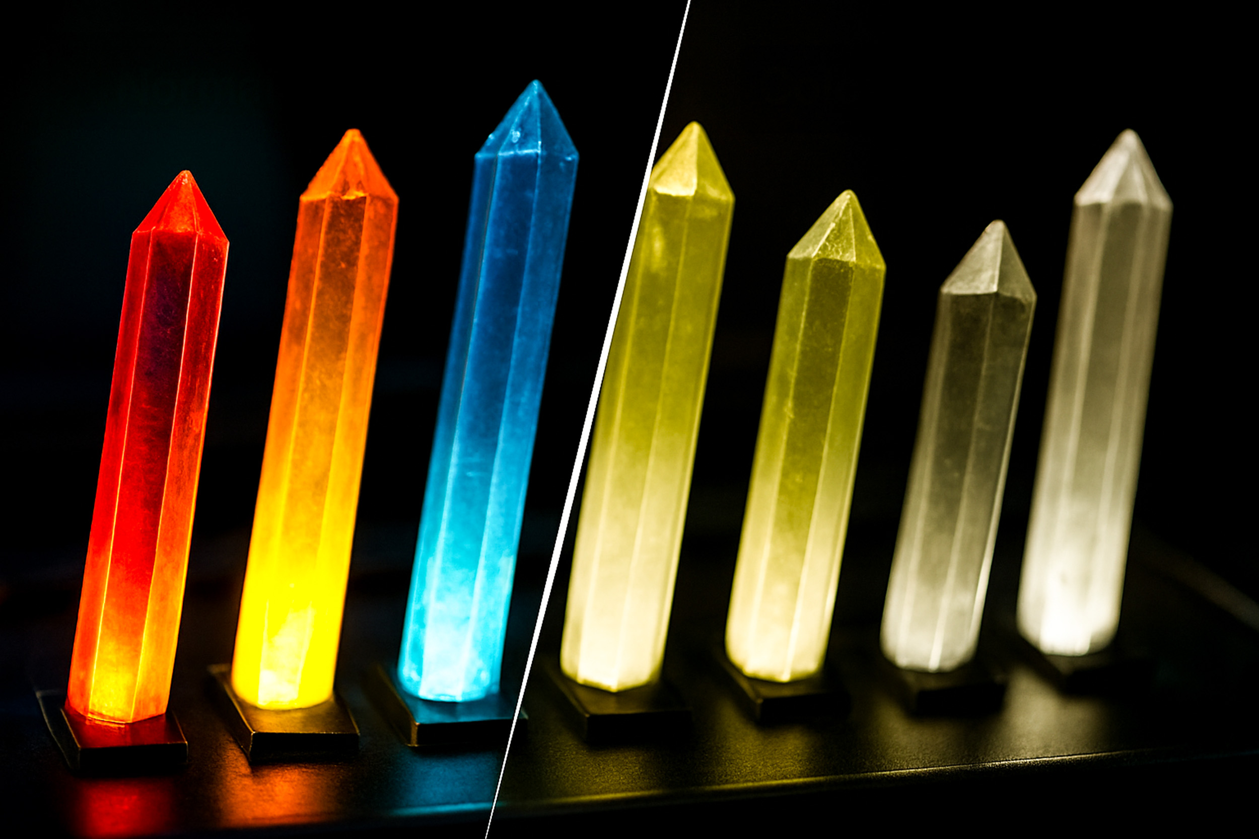
I was parked on the couch, rewatching Stargate SG-1, “Resurrection” (S07Ep19). A rogue lab. A human-Goa’uld hybrid. Glowing panels blinking like Christmas. It’s classic sci-fi drama. And right in the middle of the tension, a red light pulses urgently, unmistakably.
Except it wasn’t. At least, not for everyone.
What happens if you can’t see that red?
That one question cracked open the scene for me. What had felt like high-stakes tech now felt like a design failure waiting to happen.
Why This Really Matters
Roughly 300 million people live with some form of color vision deficiency. That’s not niche. That’s nearly the population of the U.S. The most common type? Deuteranopia, where red and green blur into a kind of visual ambiguity.
Now let’s return to that scene. It’s not just an alien artifact.
It’s a bomb interface.
If red means danger, and green means safe… what happens when someone can’t tell them apart?
That’s not just bad UX.
That’s a dangerous design.

Same Crystals, Different Stakes
Let’s zoom out. This isn’t the only time these glowing crystal interfaces show up. In “Lost City Part 2” (S7Ep22), we see the exact same UI elements, glowing colored crystals, but now they’re used to power the spaceship. Not a bomb. Just core infrastructure.

So, whether it’s powering up or counting down, the interface stays the same, visually cryptic, dependent on color alone. Beautiful, yes. But exclusive by design.
The problem isn’t just cinematic. We repeat this in real life: changing function, but keeping the same flawed form.
The Interface of Exclusion
Look at either of those Stargate moments, and the pattern is clear:
Color = meaning.
Color = urgency.
Color = status.
And if you can’t see it? You’re out.
No icons. No labels. No shapes.
Just lights. Just color. And in the wrong eyes, just confusion.
A Sci-Fi Fix: Designing for Redundancy
If you’re designing the interface for a bomb, or a power core, or an operating system, you want zero ambiguity. Here’s what a smarter, more inclusive design could offer:
- Color + Shape: Red = triangle. Blue = circle. That’s visual redundancy: two signals, one message.
- Tactile Feedback: Different textures for different controls. Confirm choices by touch, critical in high-stress or low-visibility scenarios.
- Auditory Confirmation: Each button triggers a distinct tone. A second channel to validate the first.
- Localized Lighting: Don’t bathe the whole panel in glow. Illuminate with intention. Focused signals are clearer.
- Holographic Labels: Floating, readable, adaptive. Let the interface communicate, not just look good.
Every one of these is a layer of clarity. It’s not about accommodating disability.
It’s about designing for human complexity.
Real-World Design: Why Accessibility Is the Bare Minimum
We don’t need to imagine futuristic bombs to find this design flaw. It’s already in the apps we use every day, the dashboards we build, the tools we trust.
The good news? The fix is already in the playbook.
Here’s what good accessibility looks like, and why it’s worth your attention:
- Don’t rely on color alone to convey meaning.
That red “error” outline around a form? Invisible to someone with deuteranopia. If color fails, meaning fails. - Use icons or text alongside color.
Think stop signs: red and octagonal. Dual encoding = instant recognition, no guesswork. - Ensure strong color contrast.
WCAG recommends 4.5:1 for regular text. Why? Because low-contrast UI is invisible in sunlight, on cheap screens, or aging eyes. - Add alt text, tooltips, and ARIA labels.
Buttons and icons don’t speak for themselves. Text gives them a voice, especially for screen readers or first-time users. - Test like your audience lives.
Simulate real-world vision types with tools like Stark or Color Oracle. Because you can’t fix what you can’t see.
Accessibility isn’t extra.
It’s essential.
It’s how you build trust. How do you design for stress, speed, fatigue, and edge cases, which is to say, everyone.
The only question is:
Will your design hold up when it counts?
Sci-Fi Is a Design Mirror
Sci-fi isn’t just imagination. Its intention. It shows us who we think we are, and who we hope to become.
But when our future tech is excluded by default, we’re not dreaming forward. We’re dragging our blind spots into the future.
The fix? It wouldn’t just be accessible.
It would be smarter. More adaptive. More human.
That bomb interface wouldn’t just be safer for someone with color blindness, it would be more usable in a smoky lab, or a dark cockpit, or during a crisis.
Design for the edge, and everyone benefits.
That’s the curb-cut effect in action.
“The details are not the details. They make the design.”
— Charles Eames
What to Remember
- ~300 million people experience color vision deficiency. That’s not marginal, that’s massive.
- Designing for redundancy, using shape, sound, text, and texture, is the gold standard.
- Sci-fi isn’t just fantasy. It’s a testbed. And right now, it’s failing some of us.
Your Challenge
Next time you’re watching Stargate, building a dashboard, or reviewing a prototype, ask: If the red disappeared, would the meaning still land?
If not, what one cue can you add to make it unmistakable?
Let’s design futures, on-screen and off, where no one gets left out of the message.


You must be logged in to post a comment.