AI insights
-
What inspired the creation of the new logo for UX Design Lab?
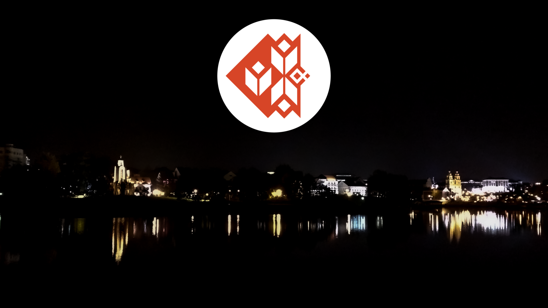
The new logo was inspired by the rich history and culture of Belarus, where the founder's journey began. It symbolizes a reconnection with these roots after seven years of growth.
-
How does emotionally intelligent design impact user experience?
Emotionally intelligent design enhances user experience by addressing user emotions, leading to improved customer retention, increased engagement, and higher satisfaction rates.
-
What is the primary focus of UX Design Lab's approach to design?
UX Design Lab focuses on delivering user-centric design solutions that empower businesses to achieve measurable growth and enhance operational efficiency through design thinking and emerging technologies.
-
How does the founder of UX Design Lab describe their daily work in UX?
The founder describes their work as creating products that make lives easier by understanding human behavior, needs, and emotions to create resonant solutions.
-
What role does empathy play in UX design according to UX Design Lab?
Empathy is crucial in UX design as it helps leaders and managers foster a culture of understanding, which can be leveraged to achieve strategic business goals.
-
How does UX Design Lab integrate emerging technologies into their design solutions?
UX Design Lab integrates emerging technologies such as AI, VR, and AR into their design solutions to create sustainable, long-term value for their clients.
-
What is the significance of the founder's background in the development of UX Design Lab?
The founder's background in computer engineering and design, including creating designs for books and posters, laid the foundation for their transition into UX, where they focus on user-centric solutions.
- Join me on a journey back to my roots in Belarus, a country rich in history and culture that has deeply influenced who I am today.
- Our capital, Minsk, and the ancient city of Polotsk are steeped in stories that echo throughout Europe.
- After seven years, I felt it was time for our brand to reconnect with these roots through a new logo.
- This redesign isn’t just cosmetic; it’s a heartfelt tribute to Belarusian culture, incorporating symbols of passion, resilience, and prosperity.
- The colors reflect our national flag, embodying purity, strength, and courage.
- Our new logo bridges the past and future, celebrating our heritage while embracing new beginnings in user experience design.
Let me take you on a little journey back to where it all began for me—Belarus. This small yet vibrant country, nestled in the heart of Europe, holds a rich tapestry of history and culture that has profoundly shaped who I am today.
Belarus has a history that is both proud and poignant. Minsk, our capital, was founded in 1067, making it a city rich with stories and heritage. Polotsk, even older, was established in 862 and stands as a testament to our enduring presence in European history.

After seven incredible years, I felt it was time for our brand to reconnect with these roots. What better way to symbolise this journey than with a new logo?
Our redesigned logo isn’t just a visual change; it’s a heartfelt tribute to my homeland. You see, Belarusian culture is steeped in symbolism, and I wanted our logo to reflect that. The new design incorporates traditional ornaments that are more than just decorative—they carry deep meanings.
Let me break it down for you:
Light, Flames, and Fire: These elements symbolise passion, inspiration, and the spark of creativity. They remind me of the countless bonfires and celebrations that light up Belarusian nights, bringing communities together.
Path, Journey: This represents our continuous journey in the world of experience design. It’s a nod to every step we take, every lesson we learn, and every milestone we celebrate.
Hard Work: In Belarus, we have a saying, “Рыбак дажджу не баіцца” (A fisherman is not afraid of the rain). This philosophy is woven into the fabric of our culture and now, into our logo. It stands for dedication, resilience, and the relentless pursuit of excellence.
Prosperity: Lastly, this symbolizes the fruits of our labour—the growth, success, and positive impact we strive to achieve for our clients and community.
Each of these symbols subtly forms the letters U, X, and D—standing for User, eXperience, and Design. It’s a hidden message, much like the hidden gems of Belarus that often go unnoticed by the world.
Then there are the colours.
We chose hues close to the historical Belarusian flag—white and red. White stands for purity and peace, while red signifies strength and courage. Together, they represent the spirit of Belarus—a spirit that I carry with me in every project and endeavour.
Logo: Old vs New
Drag the handle in the middle of the image to interactively compare our old and new logos, and see the evolution of our brand identity.
This logo is a small homage to that story—a way for me to bring a piece of Belarus into the future of user experience design.
So, here’s to new beginnings, grounded in rich traditions. Our new logo is more than just a design; it’s a bridge connecting our past with our future, a symbol of our journey and the values that drive us. I’m excited to share this with you and to continue this journey together.
And as always, we remain committed to providing exceptional service, ensuring that every project reflects our dedication to excellence and our passion for user experience design.
Thank you for being a part of our story.


You must be logged in to post a comment.